
From brand refresh to product experience: Beem
Overview
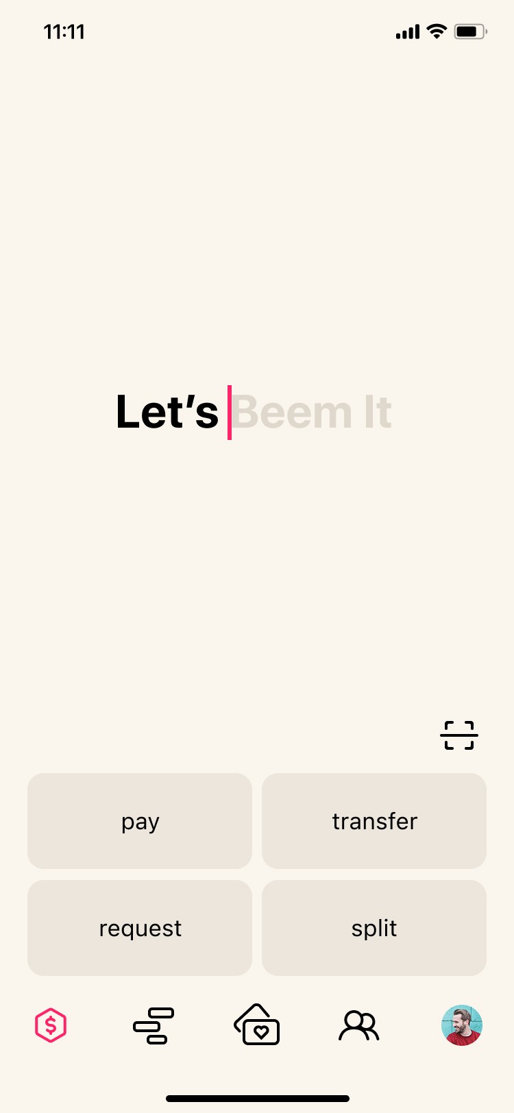
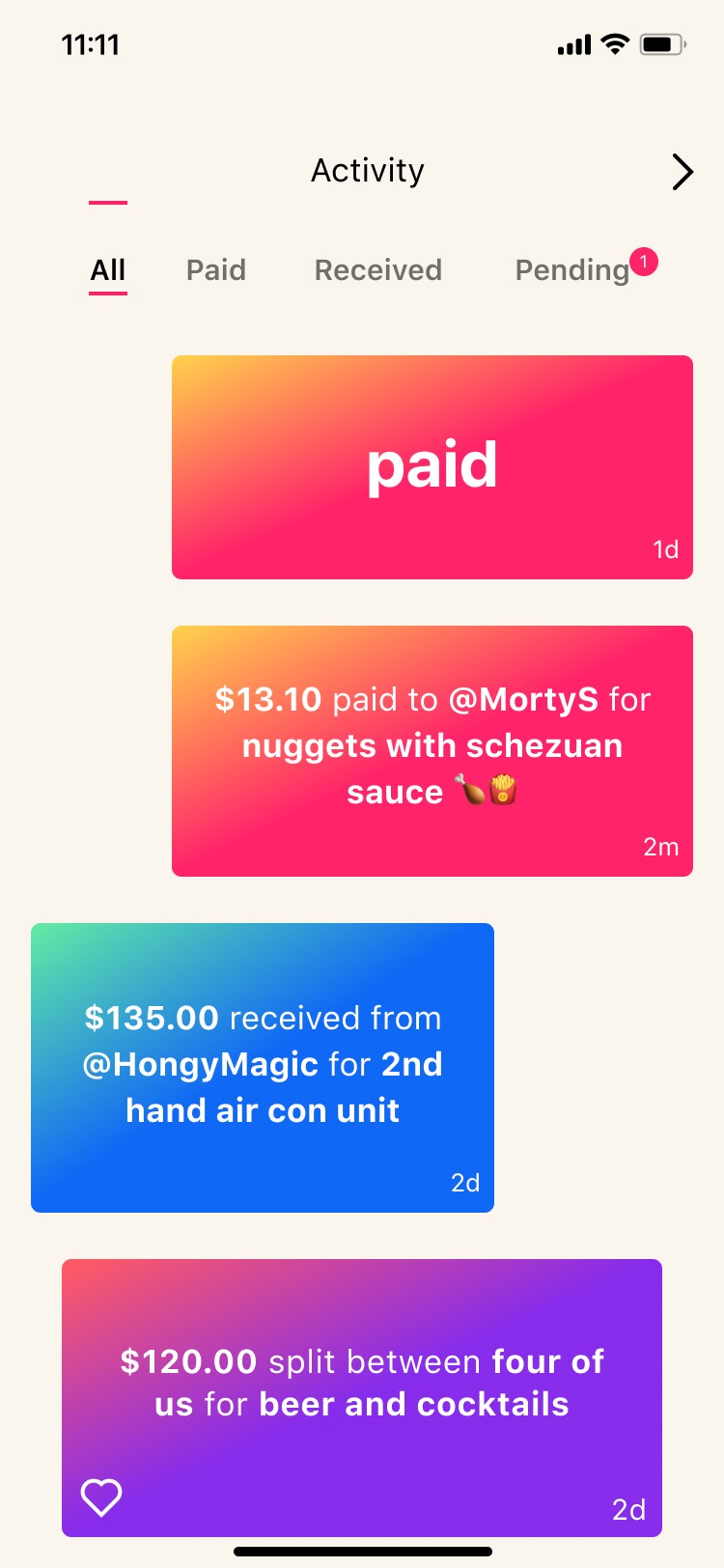
Beem is a mobile payments app that helps users send money, make payments, access rewards, and manage wallet features.
Following Beem's brand refresh, I worked on aligning the mobile app experience with the new visual identity. The project focused on creating a cohesive and trustworthy experience across iOS and Android while strengthening the foundation of the design system.
Key responsibilities
Visual design
UI design
UX improvements
Design systems
Accessibility
Design audits
The problem
Beem had recently launched a new brand identity, but many of its core app experiences still reflected the old design.
Users would see the new logo, colours, and marketing when opening the app, then immediately transition into screens that felt disconnected from the new brand experience.
"A fresh new brand at first glance…"
"But the app hadn't caught up yet?!"

Is a reskin just changing the colours and logo?
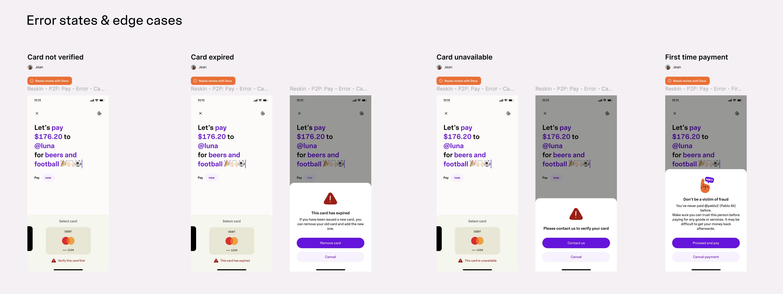
Once we started reviewing the product, we found a much bigger challenge. Some design files were out of date, some screens were missing, and iOS and Android were not always aligned, and dark mode support was incomplete.
The question quickly became:
How do we create a consistent product experience without turning a reskin into a complete redesign?
My role & Key contribution
Beyond applying the new visual identity, I helped define what the reskin should and shouldn't include.
As we audited the product, we uncovered outdated screens, UX issues, platform inconsistencies, and gaps in the design system. A key part of my role was balancing these findings against project scope, ensuring we improved the experience without turning the reskin into a complete redesign.

I worked closely with Brand, Engineering, Marketing, and Customer Support to align priorities and deliver a consistent experience across iOS and Android.
Where we started
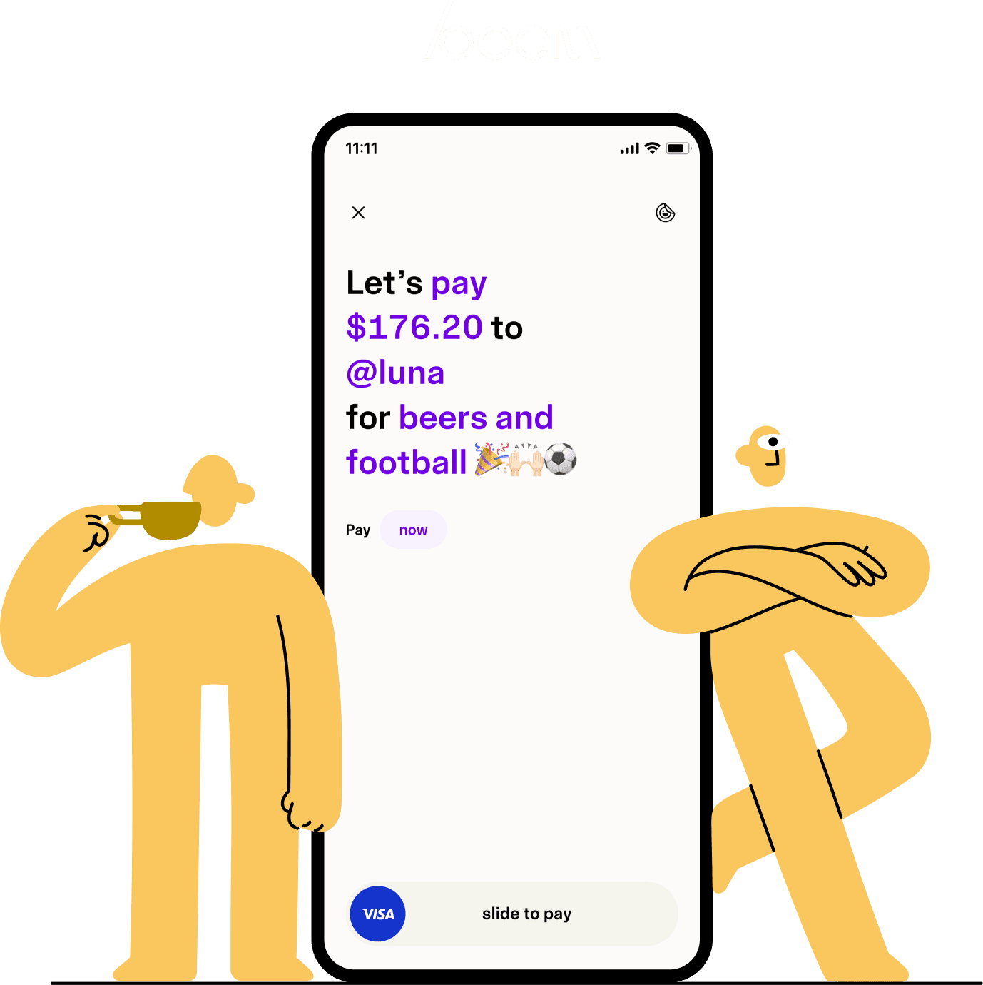
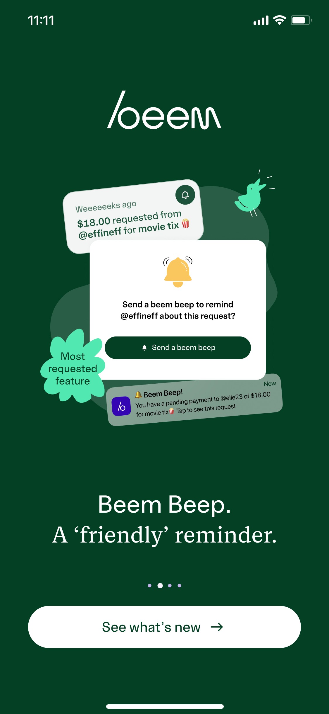
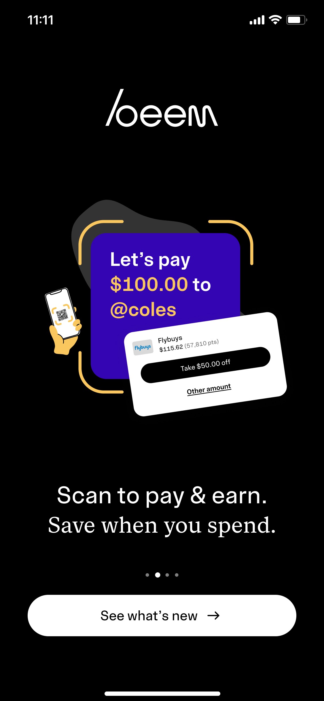
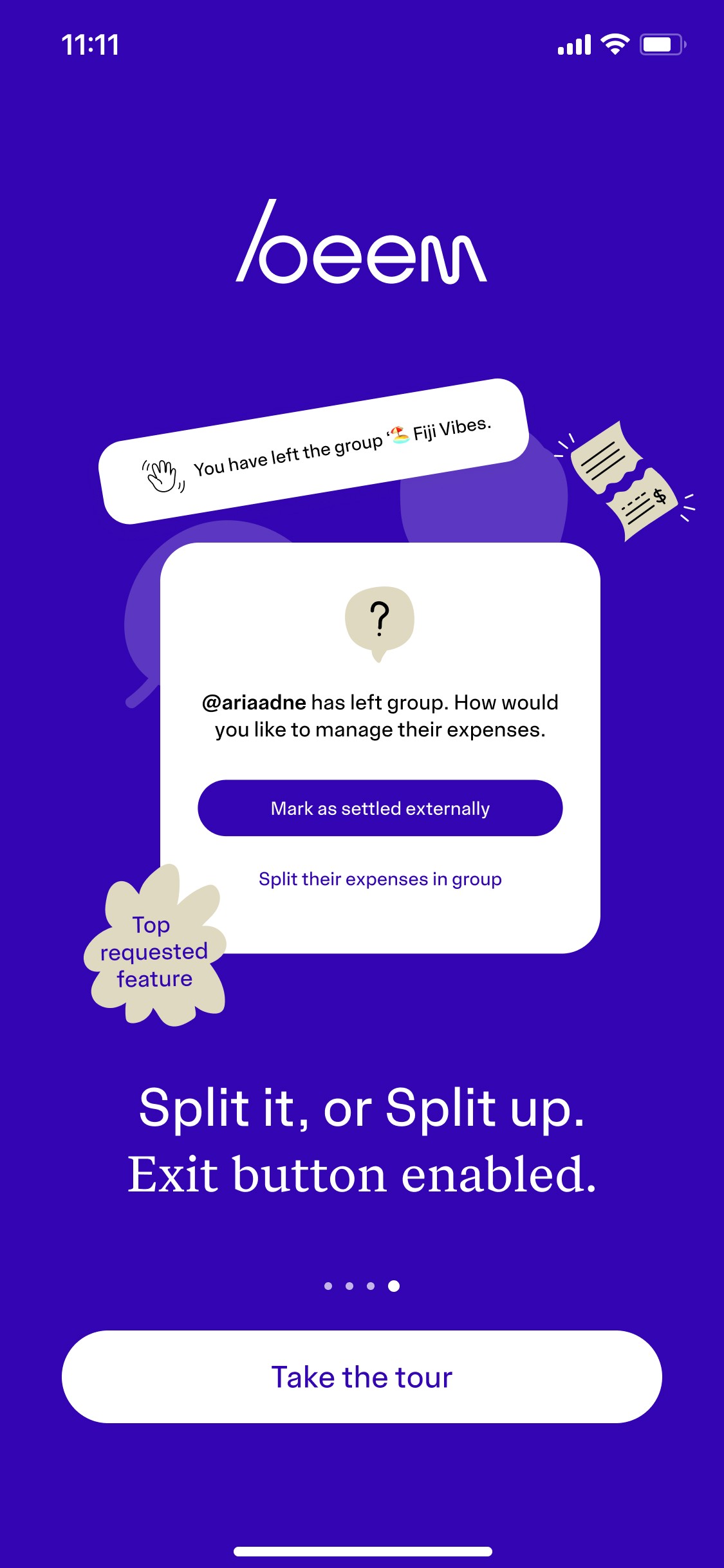
We prioritised the most visible and frequently used parts of the app. Pay became our first focus, as it sits at the centre of the Beem experience. Once the foundation was in place, we expanded the work to other areas, including Request, Split, and Rewards.
This approach allowed us to improve the experience without creating unnecessary delivery risk.
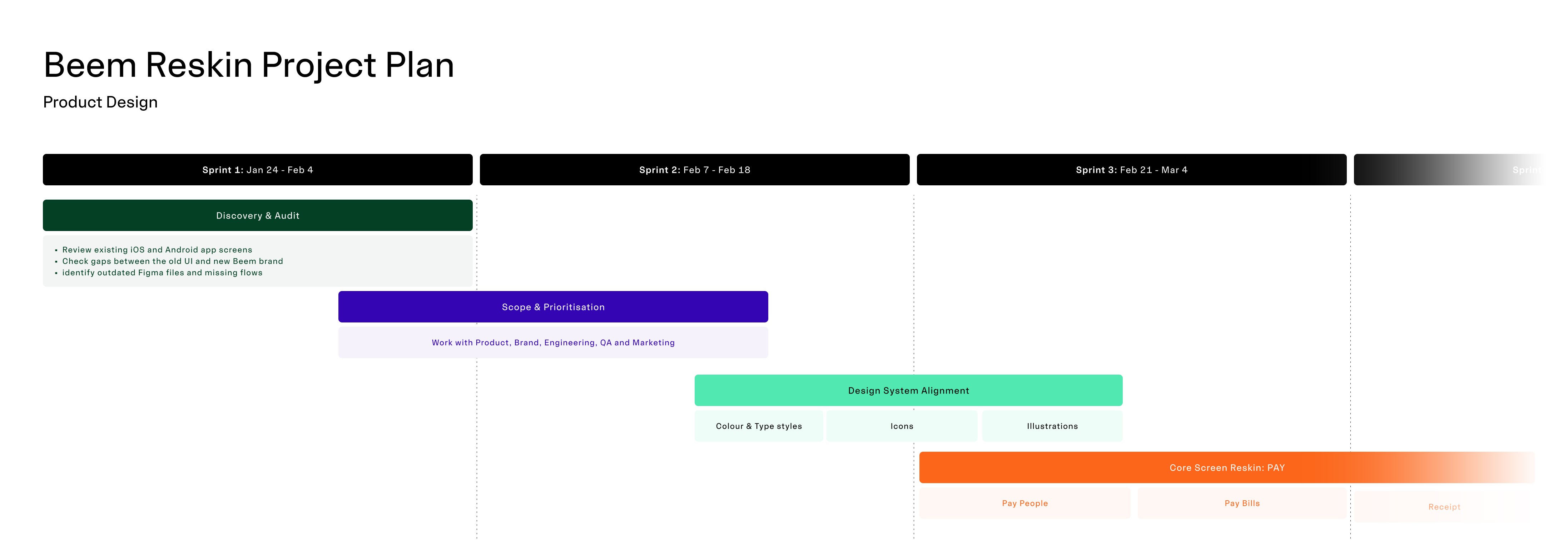
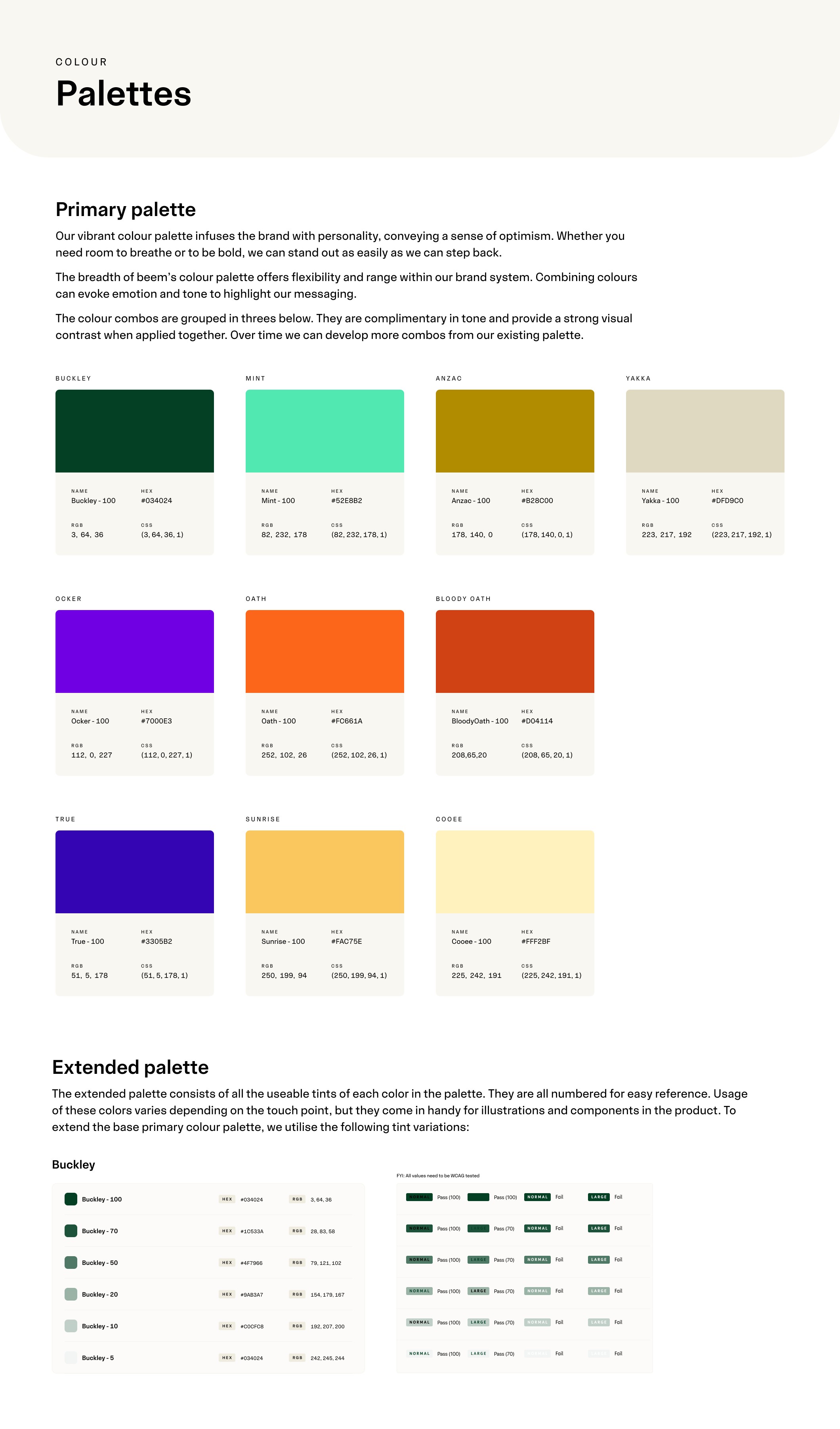
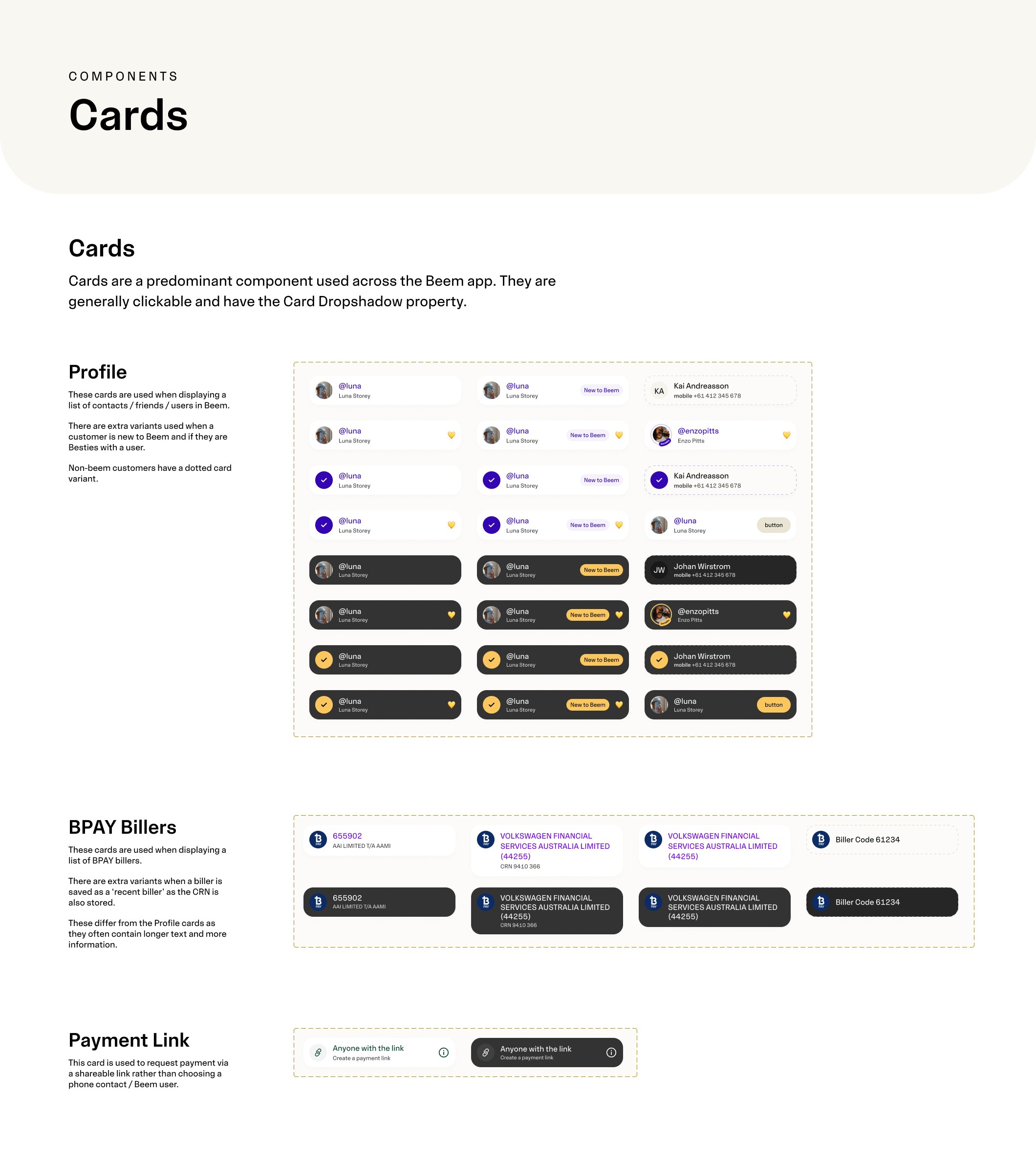
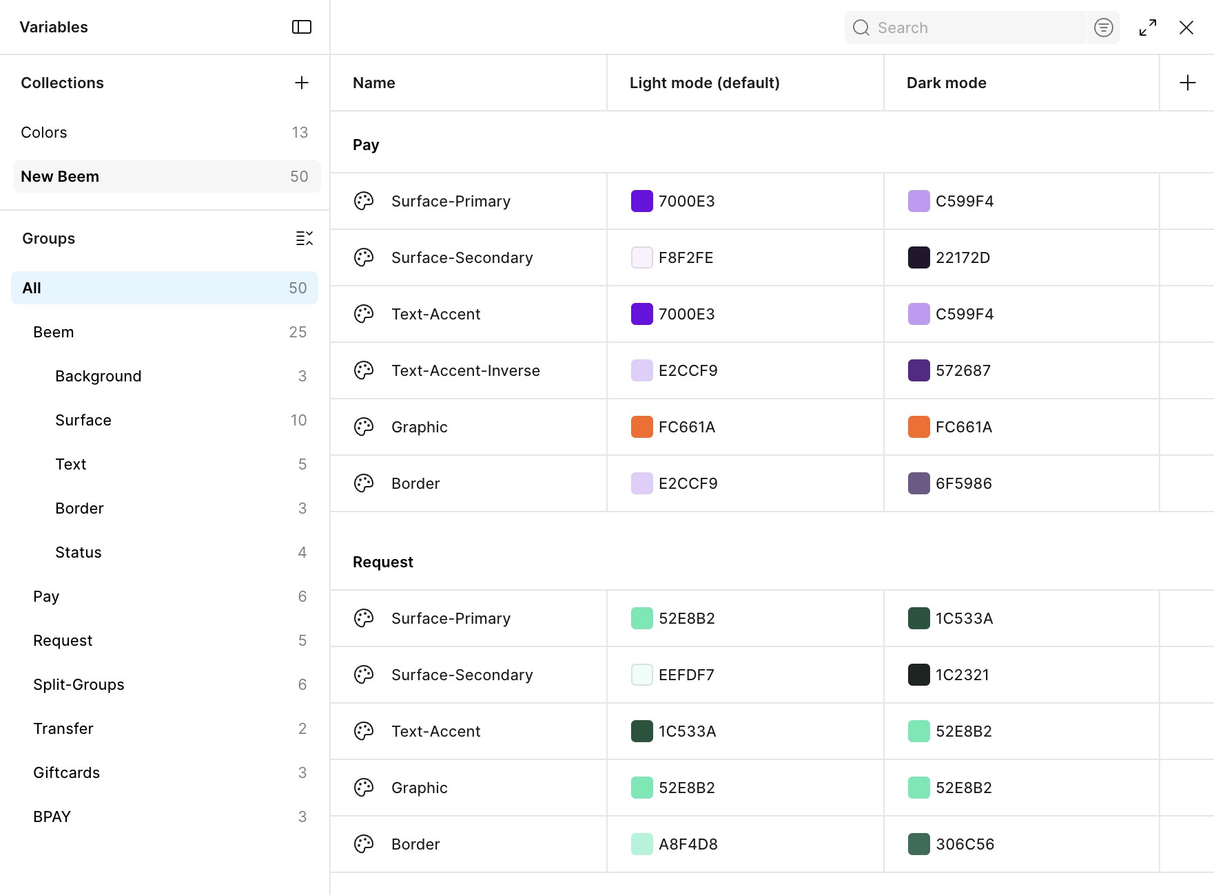
Design System
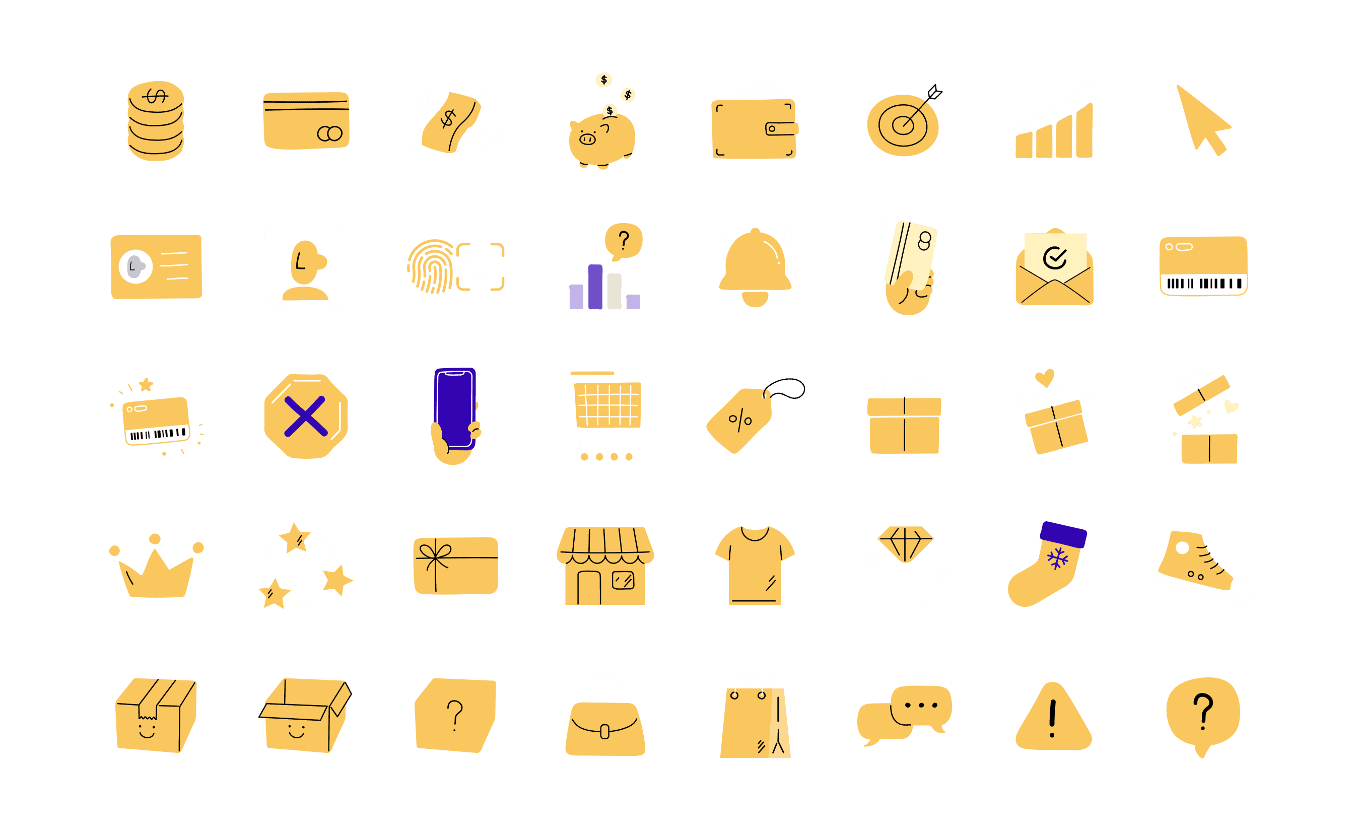
Illustrations & Iconography
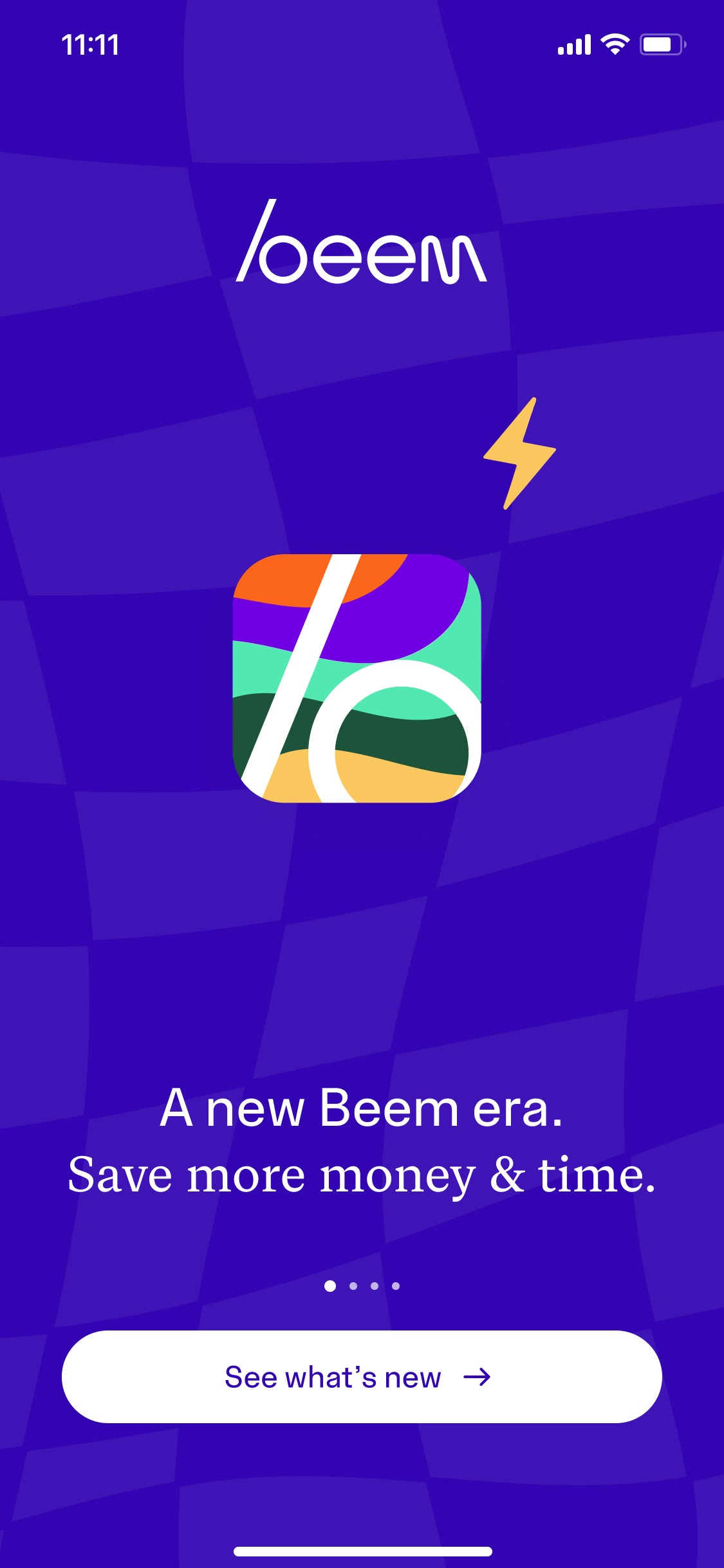
Onboarding
Pay People


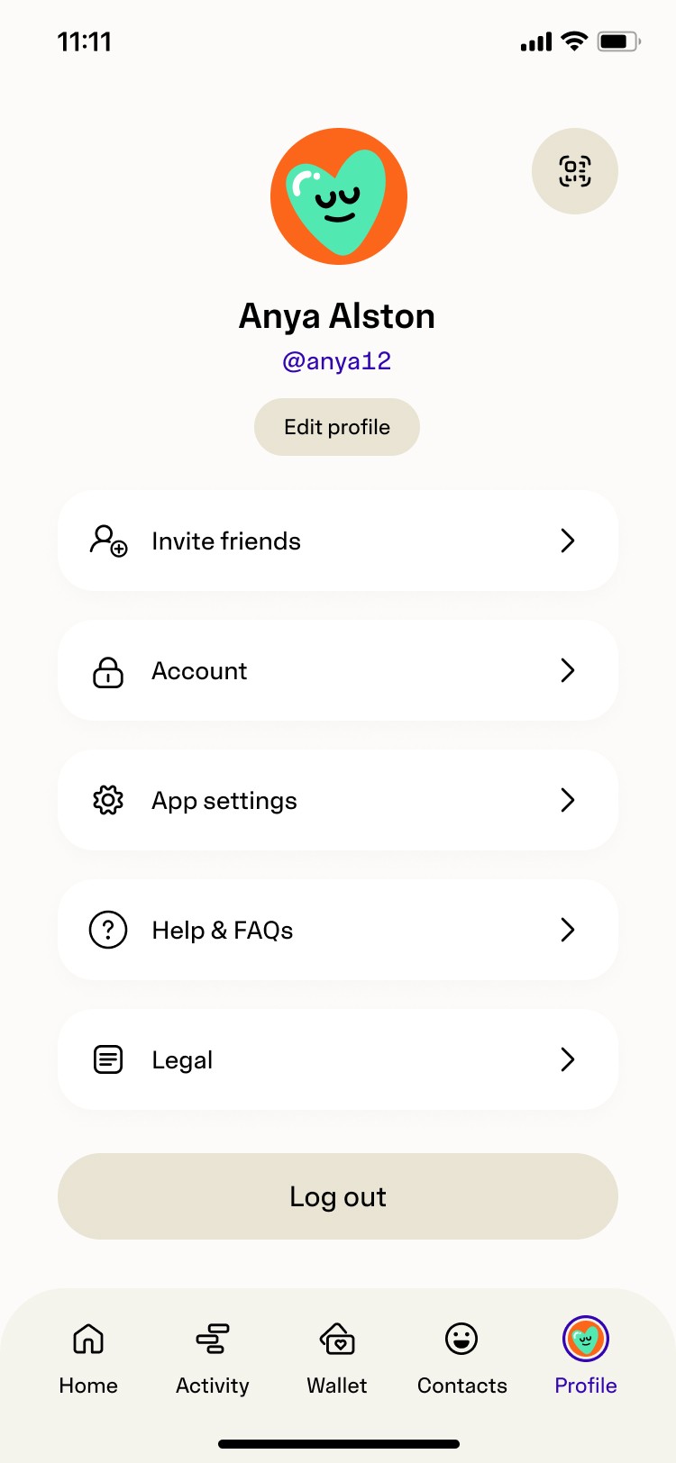
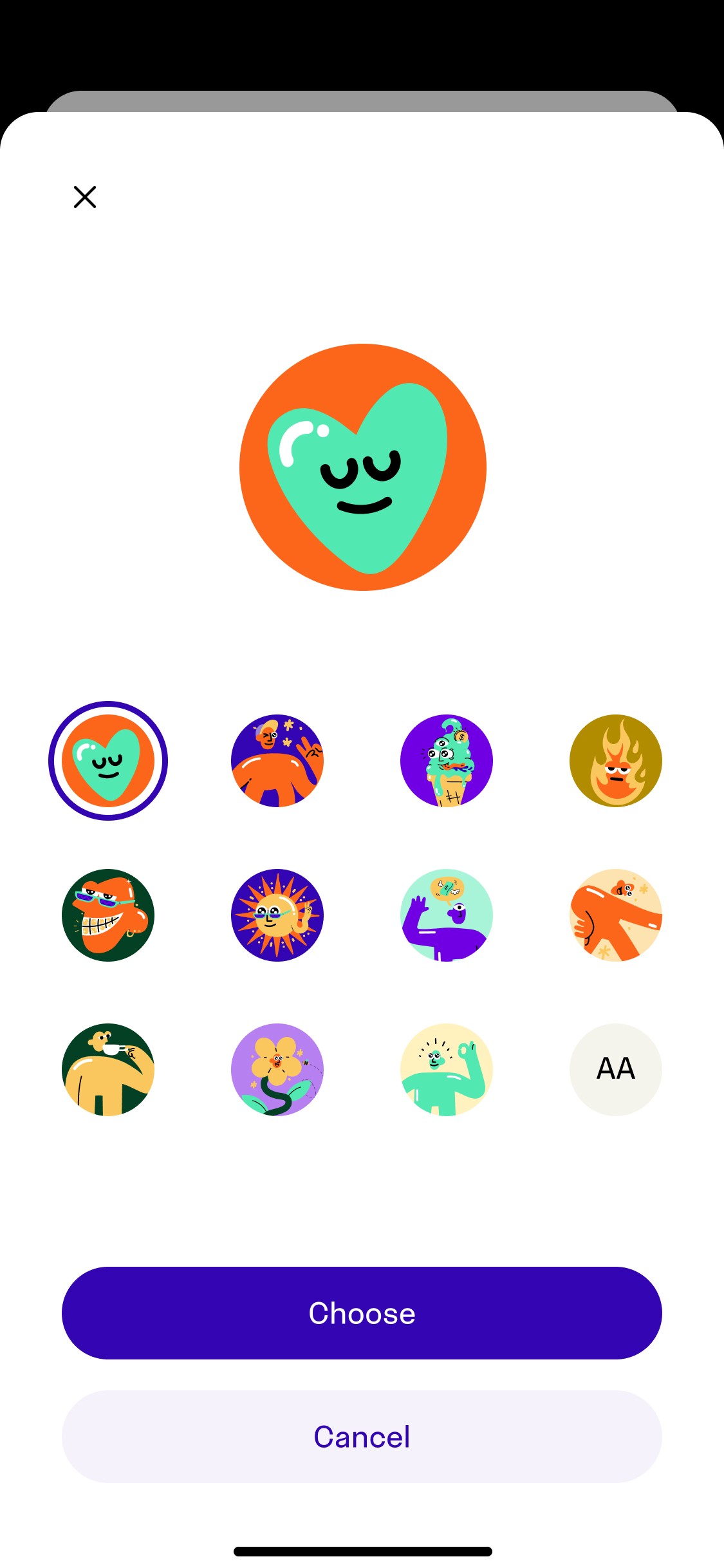
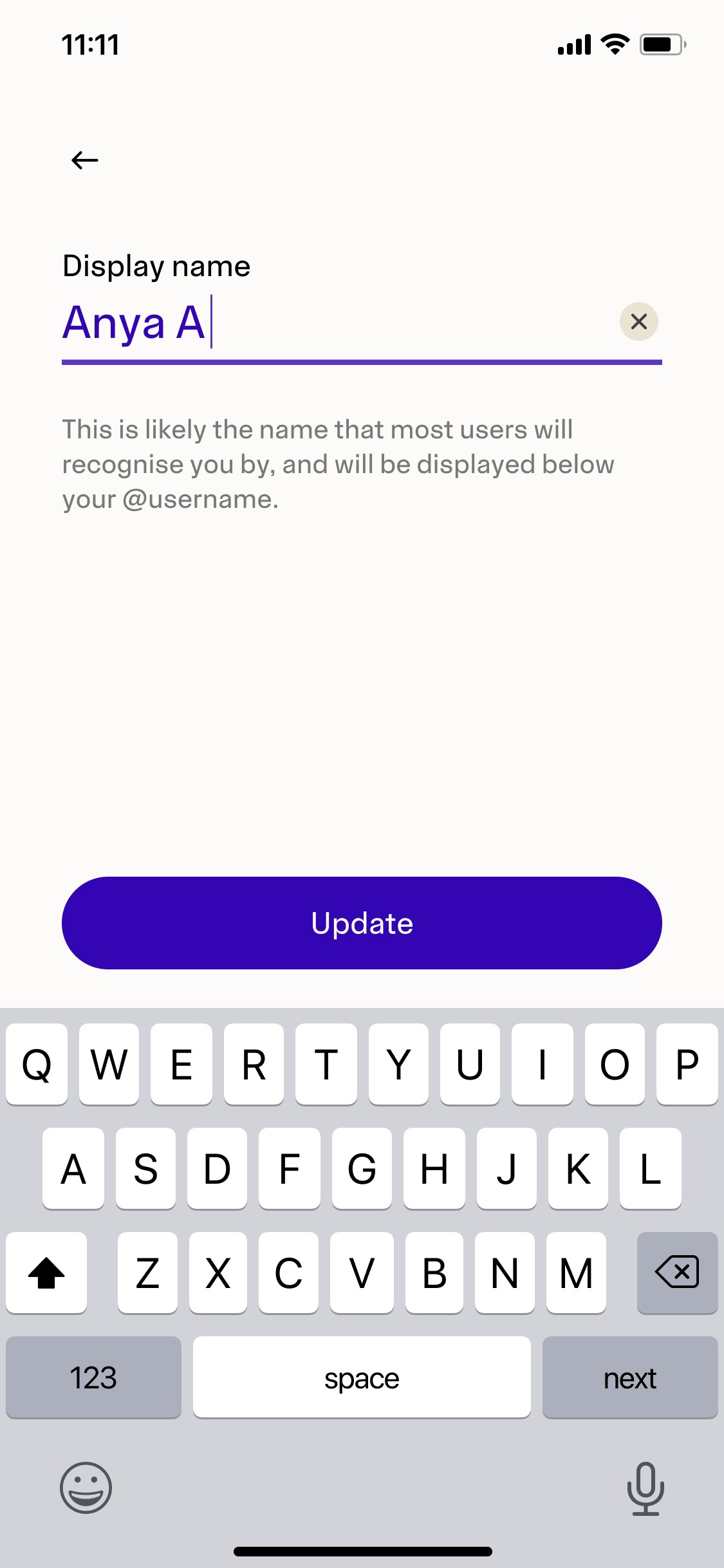
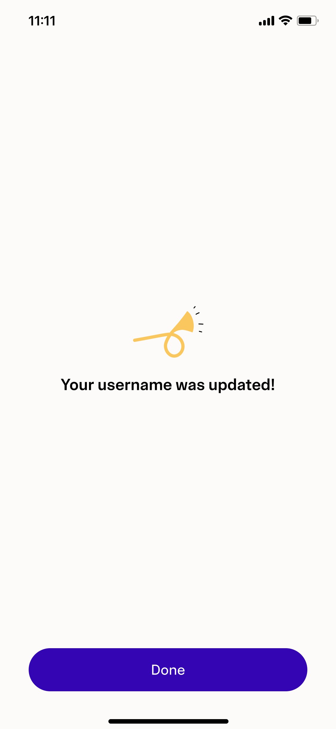
Profile
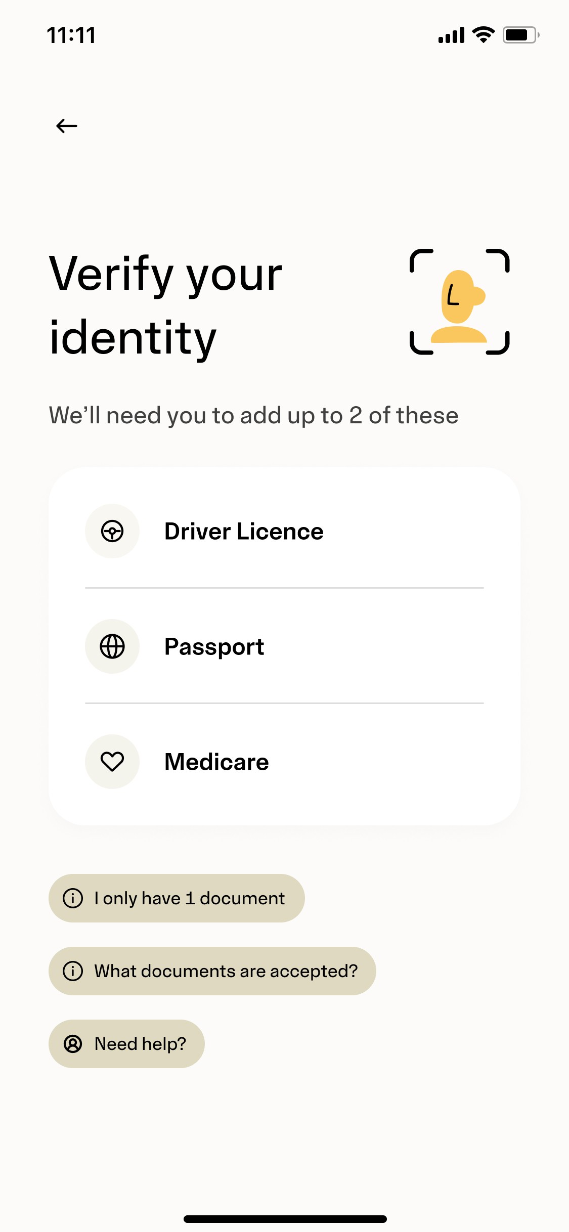
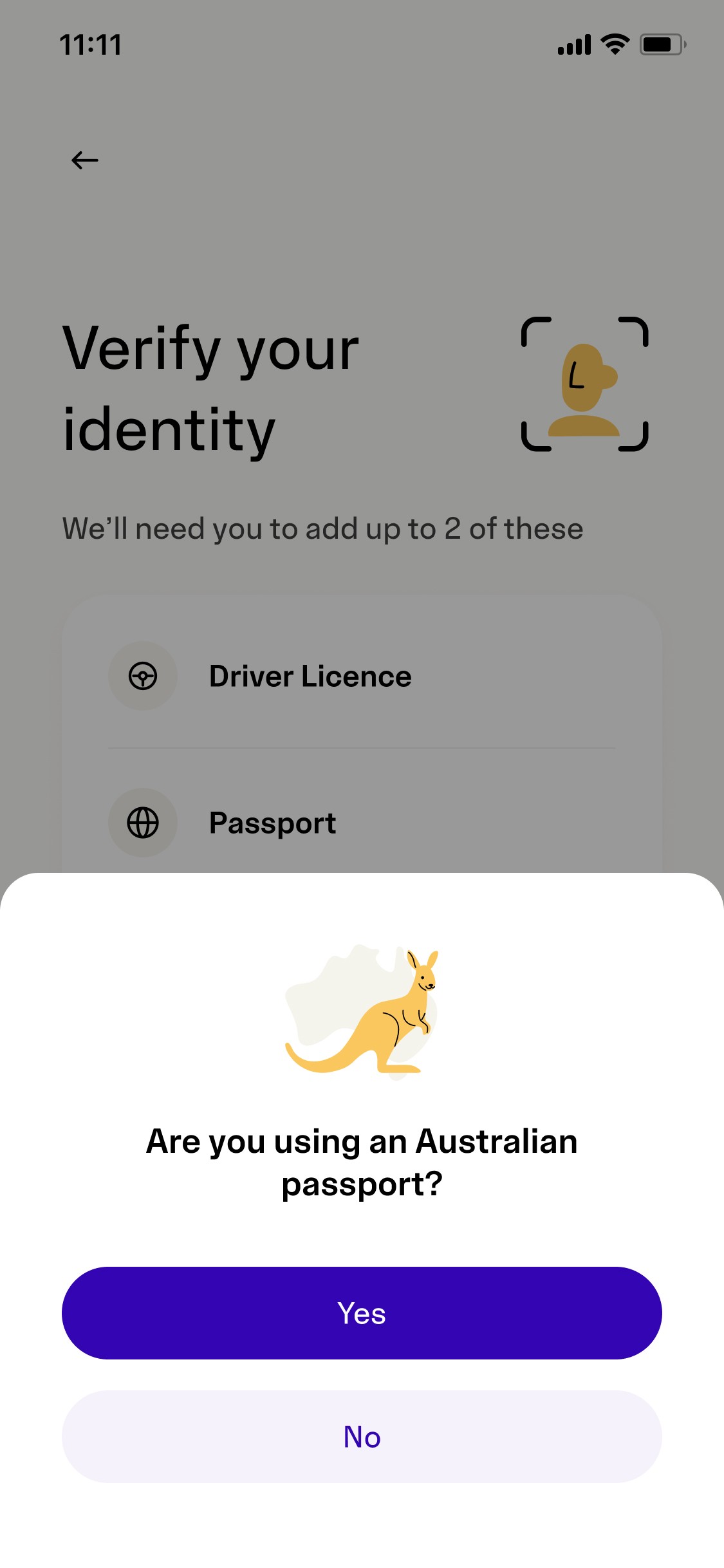
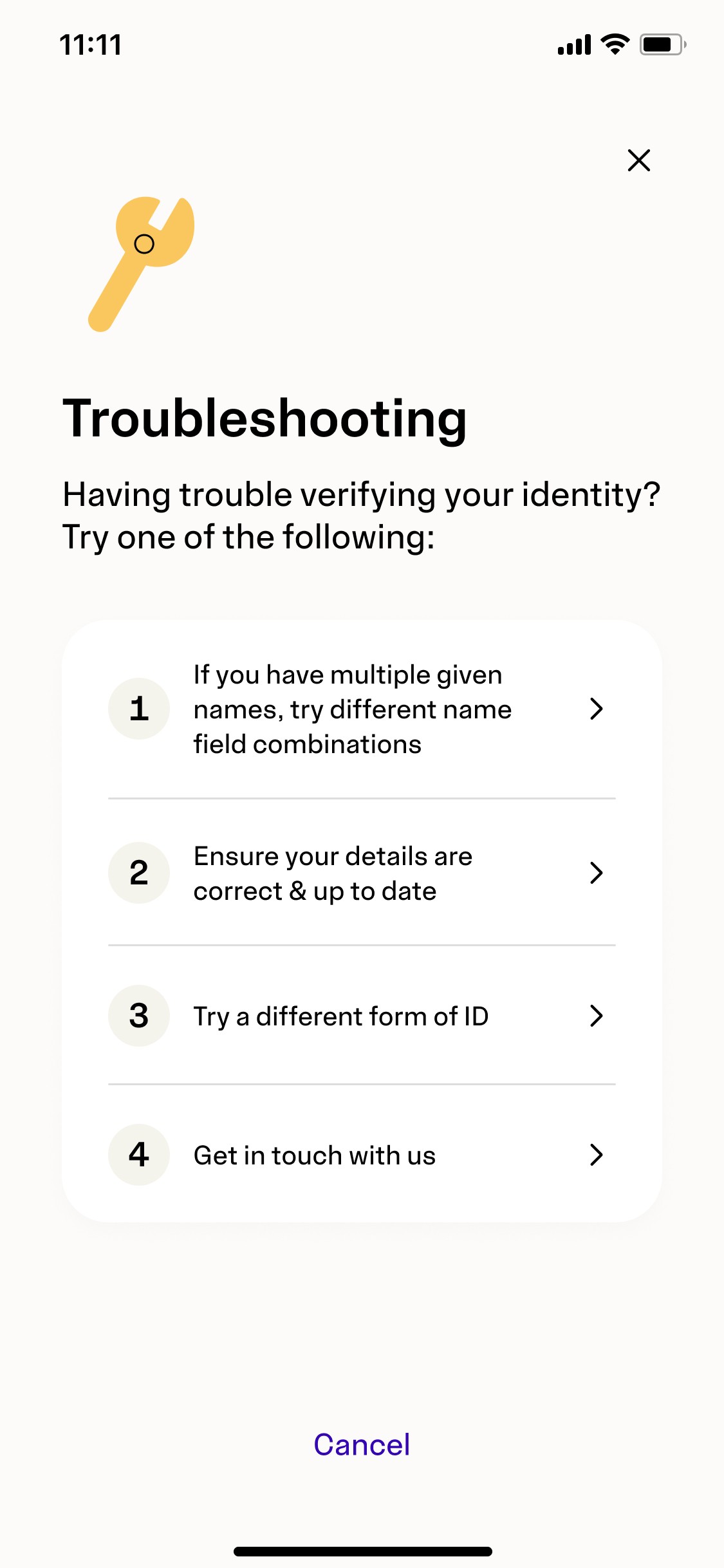
KYC (ID Verification)

Treat the project as more than a visual refresh
The goal wasn't simply to update colours and typography. We used the opportunity to improve component consistency, refine dark mode support, and strengthen the overall design system.
The Impact
The reskin aligned the product with Beem’s new brand identity and delivered a more consistent experience across the app. It also strengthened the design system, improved internal consistency, and established a stronger foundation for future product development.