Coles Pay: Designing an app from the ground up
Overview
I helped establish the foundational UX and design system for Coles Pay, defining how complex payment and loyalty services should live inside the Coles app, how each feature should scale as a reusable module, and how partner-managed experiences could feel seamless to customers.
Key responsibilities
Design systems
Visual design
Interaction design
UI design
Prototyping
iOS & Android design
Accessibility
Usability testing
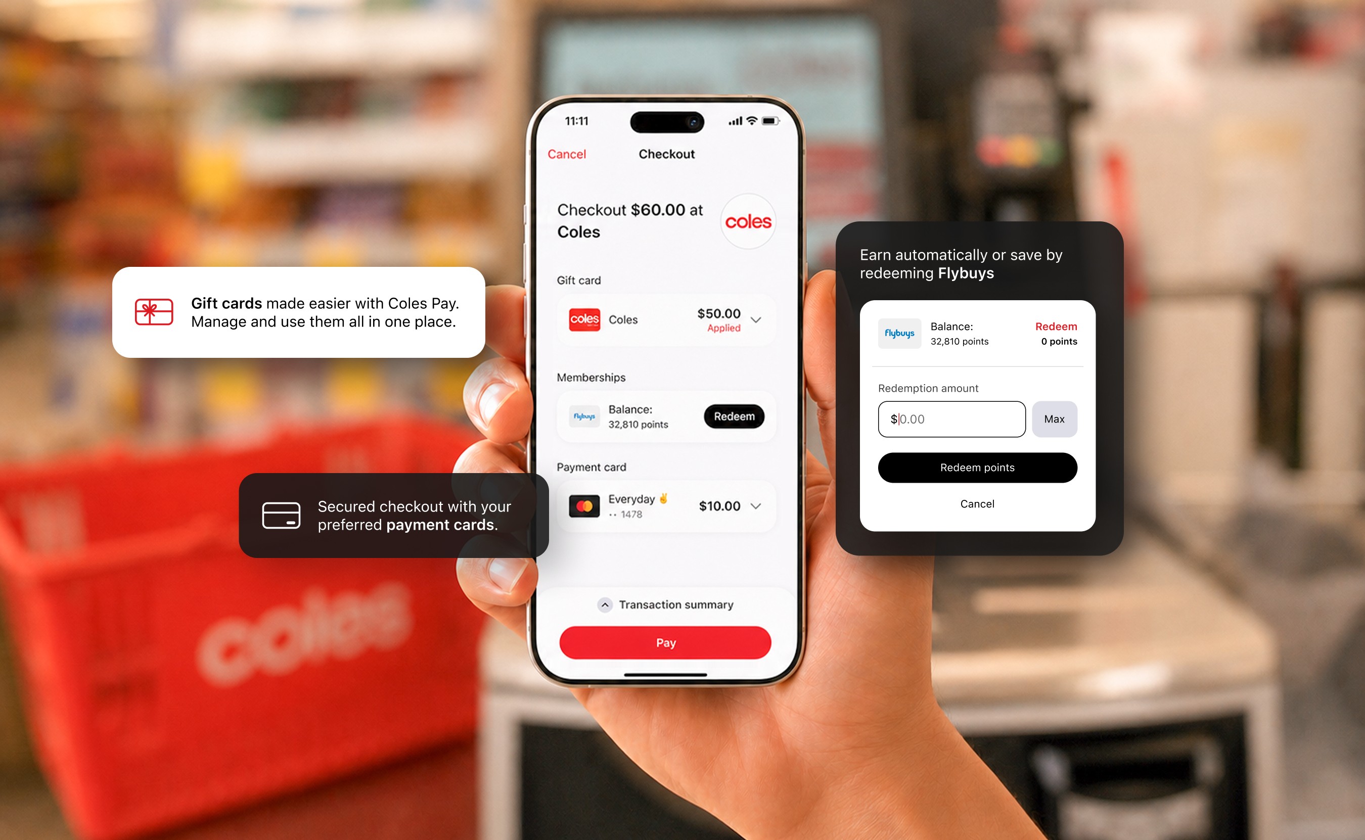
THE PROBLEM
A fragmented payment experience
Coles customers often had to manage payments, rewards, gift cards, and loyalty programs across multiple cards and apps. Tracking balances, redeeming rewards, and earning points added unnecessary friction to the checkout experience.
OUR CHALLENGE
To simplify this experience, Coles Pay needed to bring multiple payment and loyalty services into a single checkout experience.
Because the product was powered by Beem's SDK, we couldn't simply design screens. We first needed to define how the experience should work, how different services would interact, and how the SDK could scale for future partners.
This became the foundation for every design decision that followed.
Understanding the technical landscape
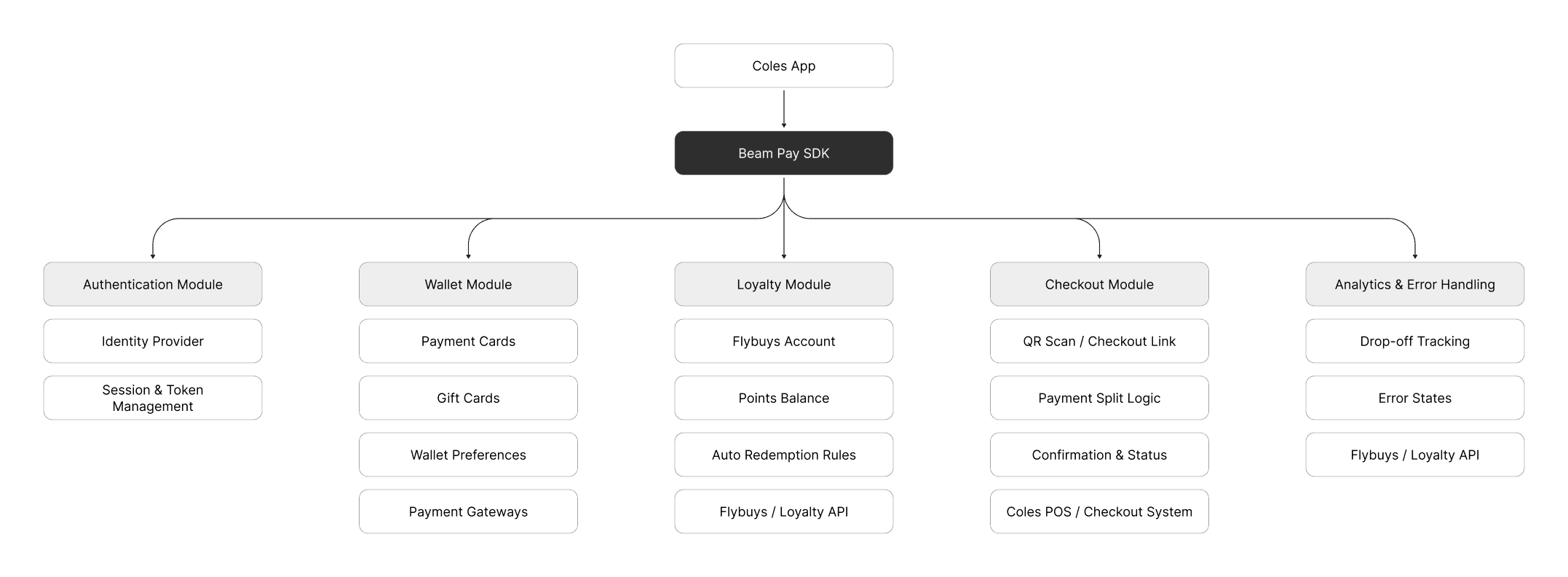
Before designing the customer experience, I needed to understand the platform behind it. Coles Pay was built using Beem's SDK, which connected multiple APIs, backend services, and partner integrations.
While this complexity was invisible to customers, it directly influenced how the product needed to behave and scale.
Defining payment and redemption behaviour
Once we understood the platform, the next challenge was deciding how different payment methods would work together at checkout.
I worked closely with product managers, business analysts, and engineers to define payment rules, redemption logic, and edge cases before moving into interface design.
This reduced ambiguity, aligned stakeholders early, and made implementation much smoother.
Designing the checkout experience
Once the business logic was defined, I translated it into a checkout experience that felt simple and intuitive for customers.
This came down to three key design decisions.
Information Hierarchy
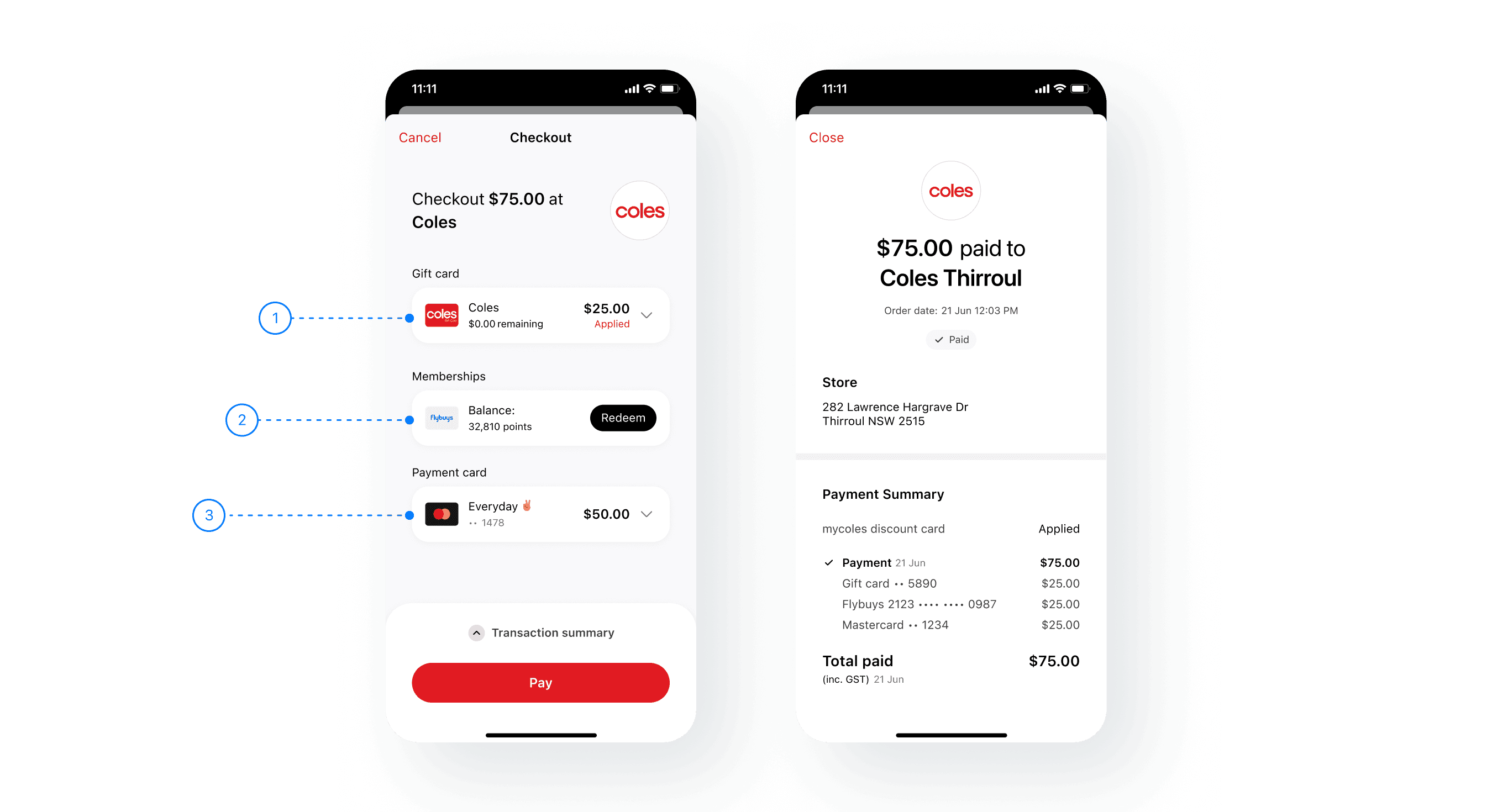
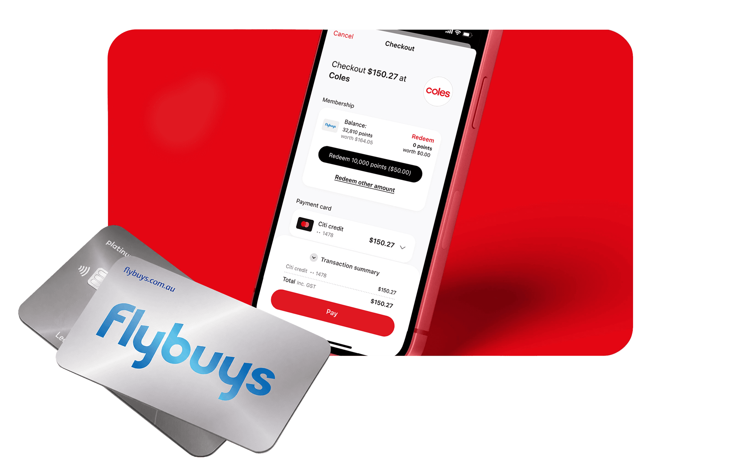
The checkout flow was designed around the customer’s payment mental model: use gift cards first, redeem rewards next, and pay the remaining balance with a payment card. This hierarchy made it easier for customers to understand how the total was calculated, what savings had been applied, and what was left to pay.

Choosing a modal approach
Stakeholders initially envisioned Coles Pay as a fully embedded experience within the Coles app. As I worked through the SDK architecture and integration requirements, I chose a modal approach that reduced implementation complexity while creating a more scalable architecture.
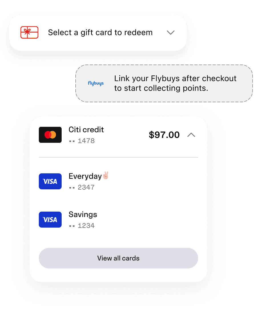
A modular checkout
I designed the checkout using reusable, expandable sections.
This reduced cognitive load while allowing future payment methods to be introduced without redesigning the overall experience.
Building the design system
Once the interaction model was defined, I focused on building a scalable visual foundation for an SDK that needed to support both Coles Pay and future partner brands.
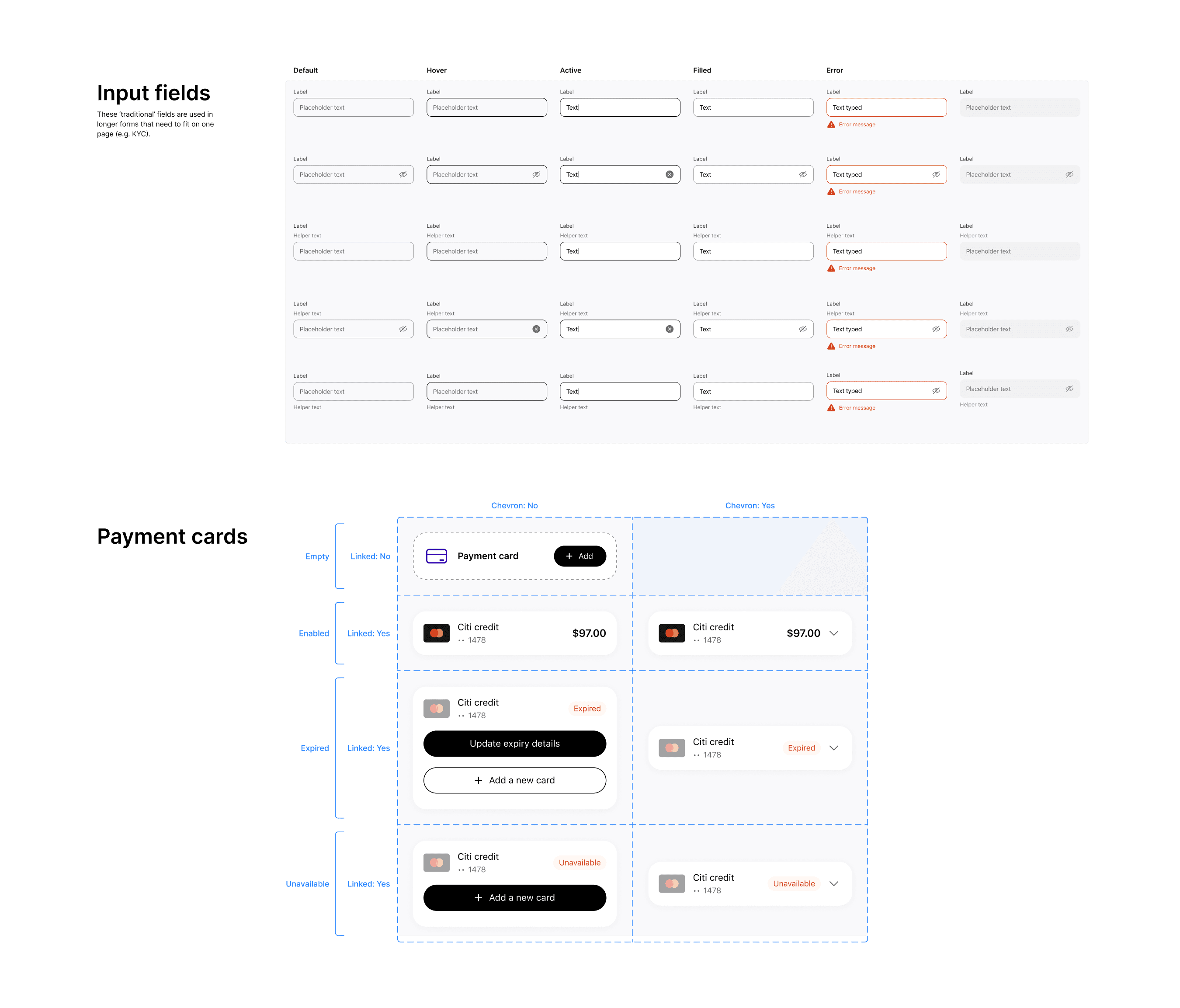
Working from the design direction set by our Design Lead, I developed a token-based theming framework that enabled partners to apply their own branding while maintaining a consistent product experience.
I led the visual design for Coles Pay, defining the iconography, colour system, typography, spacing, and component styling across iOS, Android, and web. Accessibility was embedded throughout the design process.


Designing end-to-end experiences
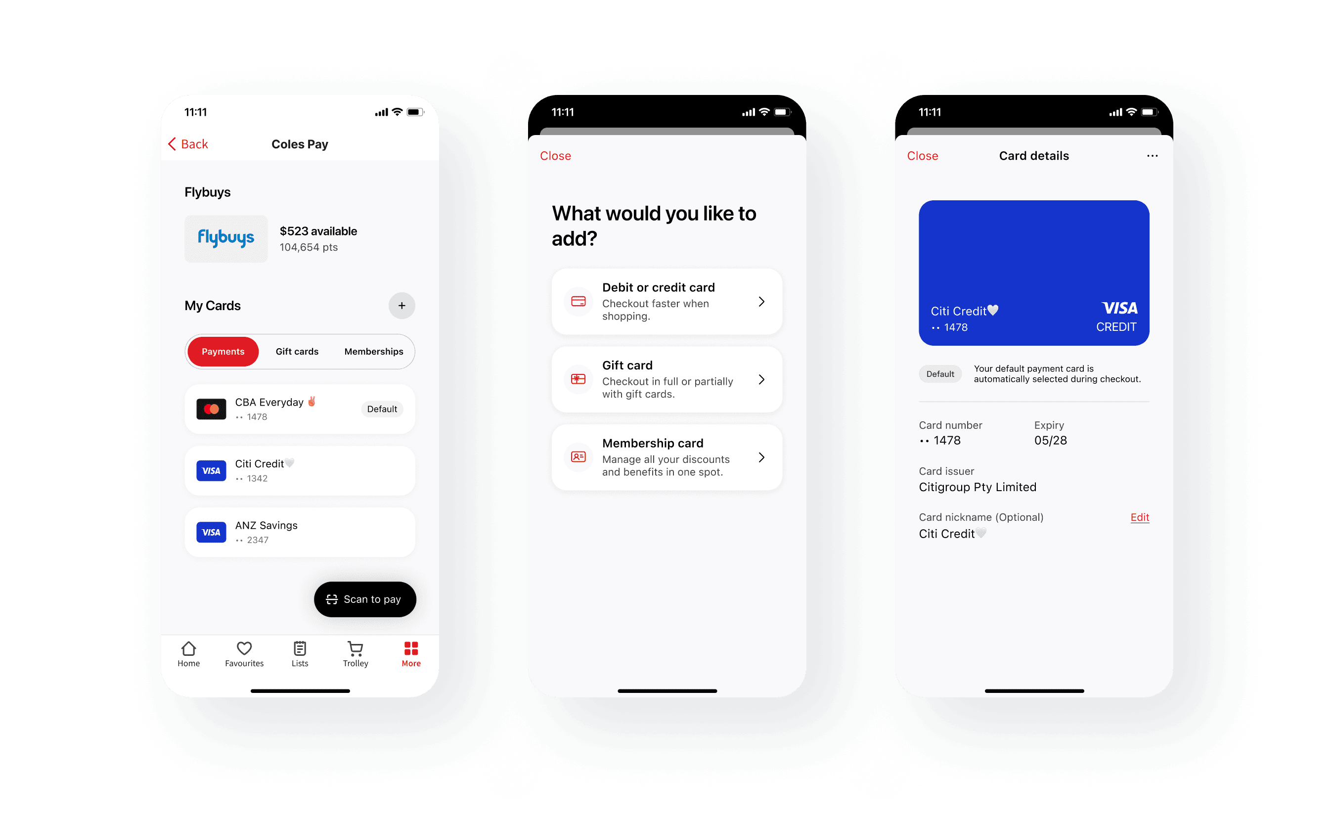
Beyond the design system, I designed end-to-end customer journeys across the wallet experience, including KYC, card management, checkout, loyalty, and payment flows.
Each flow went through multiple rounds of rapid iteration and lightweight usability testing to improve clarity and reduce friction.


Impact
The pilot demonstrated that customers were willing to adopt new payment behaviours when the experience felt simple and transparent.
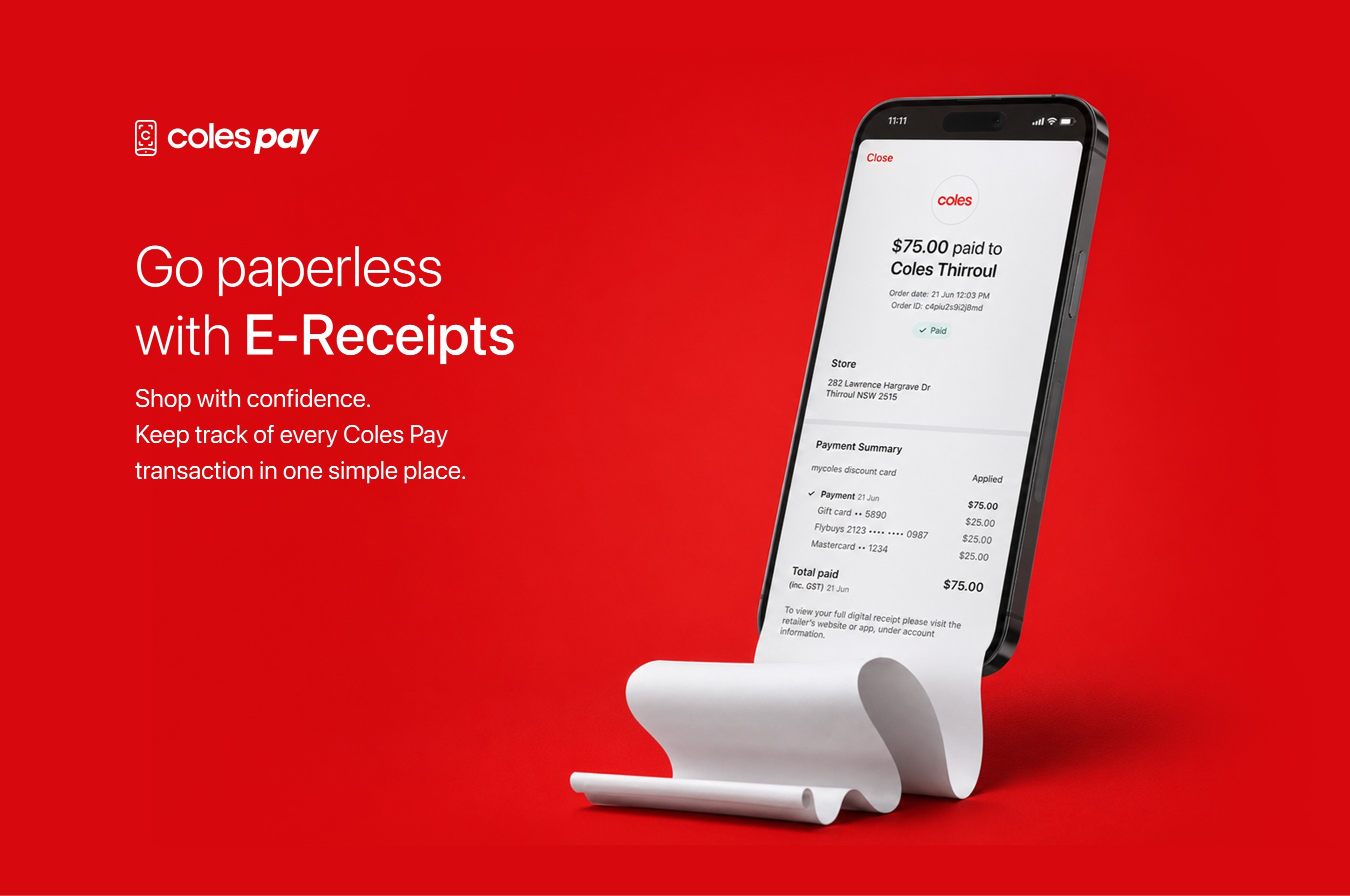
By bringing payment cards, Flybuys points, and gift cards together into a single checkout flow, Coles Pay created a more flexible payment experience and validated the concept ahead of a broader launch.
Reflection
The biggest learning from this project was that behaviour change often comes from reducing uncertainty. By making points, gift cards, and payment options easier to understand at checkout, Coles Pay helped customers feel more confident using the value they already had.